 by Gareth G » Sat Dec 17, 2005 12:26 pm
The current Spain shirt is horrible in my opinion, it look's like one of those fake shirt's you can buy while on holiday in Spain!
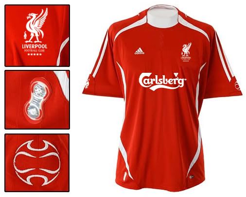
I agree that the shirt A.B. put up has a tad too much white, but it still look's pretty good. I'd like us to go back to that simple crest of just the Liverbird, incorperating the flame for the 96 at the foot of the bird is a nice touch, but I think a single flame just under the collar ( and above the player's name ) at the back would be nicer. At the start, I didn't like our new away shirt because all the detail's were printed on, but I now like this idea as it won't fade, I hope we never go back to the flock covered Carlsberg again is it fade's quickly which make's it look dirty, hopefully Adidas print our shirt's.
Last edited by
Gareth G on Sat Dec 17, 2005 12:28 pm, edited 1 time in total.


